Choozle 3rd Party Data Catalog Redesign
Project Brief
Choozle - a programmatic platform for digital advertising (90% B2B, 10% B2C).
With the platform, users are able to launch digital marketing campaigns. In order to create a campaign, you need an audience, budget, and creative.
This project was very intricate and was broken down into several parts: creating a universal data catalog, solving usability issues of the data catalog, and Audience Builder Improvements.
A separate project was the Education part. In order to create an audience, a user goes to the "3rd Party Data Catalog" tab where different data presets are available along with a search. To search for a specific data segment, a user types a keyword or a combination of words and receives results that contain keywords.
The next step is to select a segment and to add it to the audience builder where options to include or exclude are available. After the audience is saved it is stored in the "Audiences" tab. The 3rd Party Data Catalog is known to be the most time-consuming feature in the platform when it comes to education or direct use. Some users spend up to 2 hours for building audiences.
The goal of this project is to improve user experience with this feature and to decrease time spend.
My role
Research, Data Analysis, Information Architecture, Ideation, Usability Testing, Workshops Facilitation, Onboarding Guide
tools
Confluence, Pendo, Optimal Workshop, Hotjar, Smartlook, Prod Pad, White board, Paper + markers, Sketch App
Project Lifecycle
Research
User Interviews
I started my research with Pendo - a data analytics tool. This tool came in very handy when I needed to find power users of a certain page or feature in a certain period of time. I was able to set up metrics and see such granular data as number of clicks and time spent on a page, along with account names and contacts. After retrieving power users' contacts I emailed them directly and scheduled an interview.


I interviewed 7 clients total.
Key Findings:
1. Too many data segments, very hard to choose - this was the most common feedback followed by a request to have less available but more relevant results
2. Users select data segments based on familiar data brands
3. Users are very frustrated searching through endless data and usually pick whatever segments they find on top of the list
4. No keywords suggestions makes it harder because some segments could be relevant to their search but they didn't think of certain keywords that define those segments
5. Segment descriptions are not expanded so users have to make extra click every time they are interested in a segment
6. When data segments are placed to the Audience Builder they don't have unique names and multiple segments can have the same name (i.e. "household income"). This makes it difficult to optimize campaigns further based on the segments’ performance.
7. The same issue is with saved "custom" audiences - they display segments names but there is no way to see a selected segment's description
Stakeholder interviews
My next step was to interview stakeholders, who in their majority are heavy users of the platform. The CX team knows all about clients and their complaints, questions, and requests. The Fully Managed Team - the operators who manage campaigns on clients' behalf - interact with the catalog on a daily basis. The Sales Team's insight would be helpful too as they do a lot of demos and present the catalog to prospective clients.
I interviewed 7 stakeholders total.
key findings:
1. Too many data segments, it's overwhelming
2. People want to know what the better performing segment is
3. Duplicates are not indicated in the Audience Builder, as well as there is no indication between different segments with similar names
4. Search results often are not relevant to keywords
5. Search results are displayed in no order, so the good ones could be buried somewhere at the bottom and it's very time consuming to get to them
5. Some segments have $CPM, some - %CPM. It confuses clients, they don't know the difference
6. There is no availability to narrow down the search by drilling down with keywords
7. Sorting data results by parameters like popularity, relevancy, potential reach high to low, and CPM low to high would help to choose a segment
8. Not everybody knows how to use quotes (they are used to lock the order of keywords in a phrase for an exact search)
9. The categories provided by the platform don't make a lot of sense
10. Ability to filter search results would help
Research analysis - Affinity Diagram
For data analysis, I used the "Optimal Workshop" tool. I created cards with the most common statements and combined them in groups to see what the main pain points are.


After doing this exercise I was able to pull out the most important areas we should have focused on.
Summary of Key Findings:
There is too much data in the catalog and it's overwhelming and confusing
The main question is "How to choose segments?"
Users use Search option the most, ignoring all the data presets except the Demographics preset
It would be beneficial to have tiered search, including categories to narrow it down
It would help to have keywords suggestions
It would help to have data segments suggestions based on the highest potential reach and lowest CPM
All data results should populate in some order, probably highest potential reach and lowest CPM
It requires an extra click to expand every single segment description
Different data brands have the same segments under different names which makes it hard to avoid duplicates
There are discrepancies between data segment descriptions and titles based on keywords ( i.e. "life insurance" - Night Life segment, "income" - High Income Travel segment)
There is not any option to filter search results
There is a big portion of education needed around how to pick segments, the difference between "and" and "or" statements, what brands or segments are the most popular, how to use quotations, why Data Alliance brand has % CPM only
There is no description of data segments in the audience builder, nor does it show duplicates (in order to edit an audience or view through selected segment descriptions a user has to create a new audience from scratch)
Data Analytics
I used Smartlook and Hotjar tools for tracking user behavior. Using video recordings I was able to clearly see how users interact with the data catalog and how they performed their search and audience creation. I revealed:
1. Huge time spend on browsing around and trying different segments
2. Frustration, as users were randomly clicking on segments and frequently exited out of the Catalog section not finishing audience creation
3. Often users would go to their previously saved audiences and remove some segments from there as their attempts to build a new audience weren't successful
4. I saw a recording when a user spent a long time trying to create an audience, but after being overwhelmed with the data provided he went straight to the Account Cancellation section and requested to cancel his account
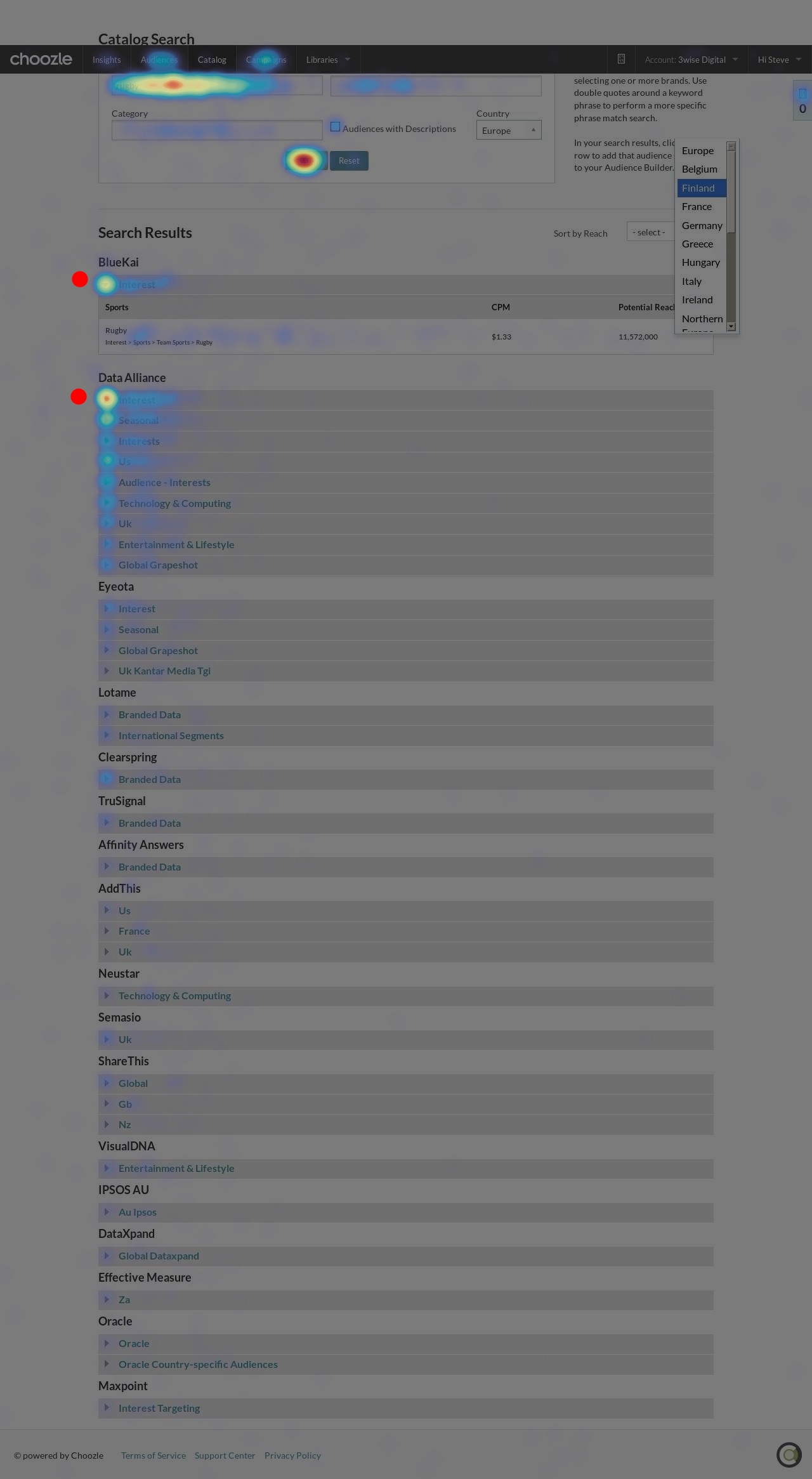
5. Most of the times users go to the Catalog Search section, ignoring the presets
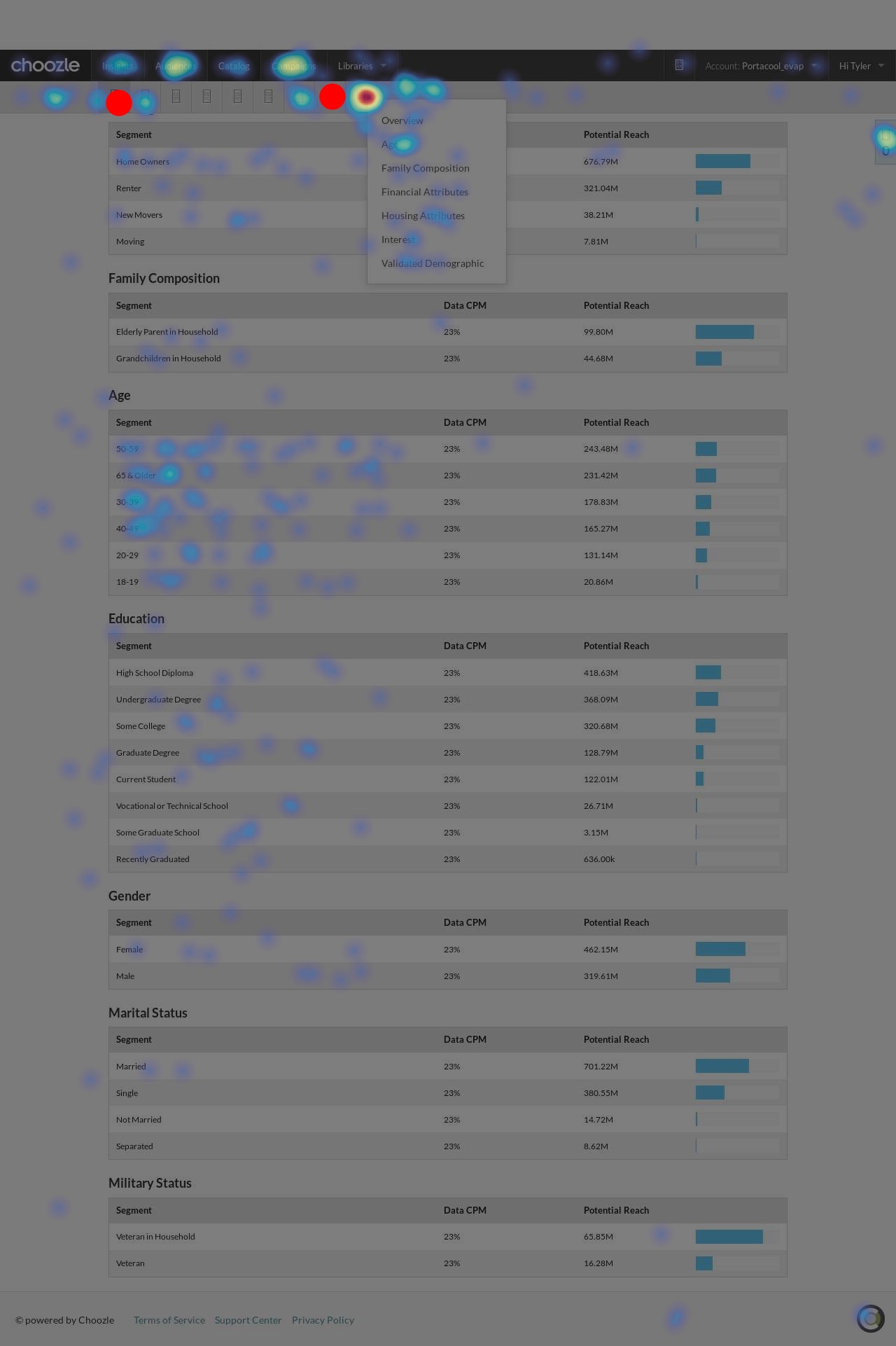
The heatmaps depict:
The hot spots on the "Audiences" page are Demographic and Search buttons (marked with red)
Users tend to click on the first few data brands in their search results. Almost nobody gets through the whole list of data segments
Personas
I created personas together with stakeholders who work closely with the clients (CX Team, Sales Team) and are users of the platform themselves.
Primary Personas:
Fully managed operators (internal users)
Strategic Operators


Secondary Personas:
Support Center Clients

ideation
As the project was broken down into 3 smaller ones, the ideation went around separate parts: Data Catalog UI, Audience Builder Improvements, and Audiences sub navigation + Information Architecture (part of creating a Universal Data Catalog with 1st and 3rd party data combined)
Data Catalog UI
Original UI


Sketches
I started with a simple sketching of my ideas on paper to get a visual understanding
mockups Round 1
Pain point:
The Catalog Search is a subcategory along with other categories under Audiences tab. But research revealed that the Search option is used the most out of all subcategories (as well as Demographics).
Solution (marked with red dots):
Eliminate all catalog tsubcategories.
Move the catalog to the Audiences tab and use a + icon to create new audience - consistent UI with the current Library where users create assets as creatives, Geo lists, Site lists by using a plus sign tab.)
Pain point:
No options to perform tiered search, including categories to narrow it down
Solution:
Allow to enter multiple keywords (winter, ski, sports)
Allow to search for a segment within the initial search results (search bar)
Pain Point:
Hard to choose a segment
Solution:
In the search results to show Top 5/Most popular segments on the top of the list
Pain point:
Data results are not populated in any order
Solution:
Highest potential reach or lowest CPM on top
Pain point:
Users make extra click to expand descriptions
Solution:
Descriptions are expanded by default with an option to condense them
Pain Point:
There are discrepancies between data segments descriptions and titles based on keywords ( "life insurance" - Night Life segment, "income" - High Income Travel segment)
Solution:
Allow to select Match a keyword by title, description or both
Highlight the keywords in a matching title or description
Pain Point:
There is no option to sort results
Solution:
Allow to sort by relevance, reach, CPM or popularity
Pain Point:
There is no description or data brand of data segments in the audience builder and in the Custom Audience tab
Solution:
A user can hover over a segment and see the segments' Data Brand, CPM, reach and description
Workshop 1
Before I put the workshop results here, I'd like to explain what kind of workshop it was.
Every project is a dedicated cycle of 6 weeks. Each of the cycles starts with a Design Week where my Product Team facilitates workshops with stakeholders and developers, pitches projects that are based on my previous research/discovery and finalizes Big Batch and Small Batch projects for the following 6 weeks. After that the dev team starts building.
All of our stakeholders are users of the platform and some of them (e.g. Fully Managed team that operates on behalf of their clients) work a lot with the current UI and features.
While the building process happens, I start the discovery/investigation for the next cycle.
When the dev team is ready to present the new feature, I start usability testing sessions. After that, I iterate the design and the dev team continues building so then we release the feature. Depending on the project it could be just internal release initially to run and fix bugs as well as to gather internal feedback. And after that we release to the clients.
Going back to the workshop: this one was in the beginning of the Design Week and touched on several projects including the Data Catalog. What happened there:
1. Story mapping the audience creation process with stakeholders
2. Feature investment exercise with stakeholders
3. Effort estimate by the dev team


This workshop helps to bring user needs and business goals together
As I come prepared and present some initial wireframes, stakeholders can have a visual example of what is being pitched ( it's common that when the Product Team talks about new features and opportunities stakeholders have a slightly or completely different picture in their mind)
Voting and prioritization defines what I'm going to be focusing on at first and what priorities for design are
Design
Mockups round 2
I iterated the mockups based on the workshops results.
Sub navigation:
The idea here was to remove the Catalog tab and to give the ability to create new audiences from "Audiences" tab. This follows the current app's pattern - users create and store assets in the Library section.
Search:
I had 4 different options for the Search part of the Catalog. I ran a quick test with the stakeholders to define which one was the most for them.
The most favorite one has:
1. a variety of options to narrow down the search
2. a search similar to the Google search which is a familiar to everybody functionality
The most favorite option.
Search Results
I looked at numerous e-commerce sites (including major shopping sites Macy's, Nordstrom, Bloomingdales, Walmart, Target etc) and noticed a certain pattern for a Sort By and Filter By fields. Filters tend to be on the side (usually left) of the search results, whereas sorting is usually above the results table.
This option was the favorite one amongst the stakeholders because of:
1. The similarity with shopping experience
2. Description of data segments were available to view instantly
3. Columns showing Data Brand, Category, Potential Reach, CPM
4. Pagination and significantly reduced amount of search results per page (vs the current version where users have to endlessly scroll to the bottom)
Favorite search results UI
Final designs
Considering the feedback, I made some final design decisions on my own and presented the new UI. Below are the mockups that were passed to the developers.


Usability Testing (Internally)
A few weeks later I tested the design that was built by the developers. The design wasn't implemented a 100% at that point, as it was a mid way check of the system's functionality ( a new database was built in to this new catalog).
However I had an opportunity to get a feedback on usability so I went for it.
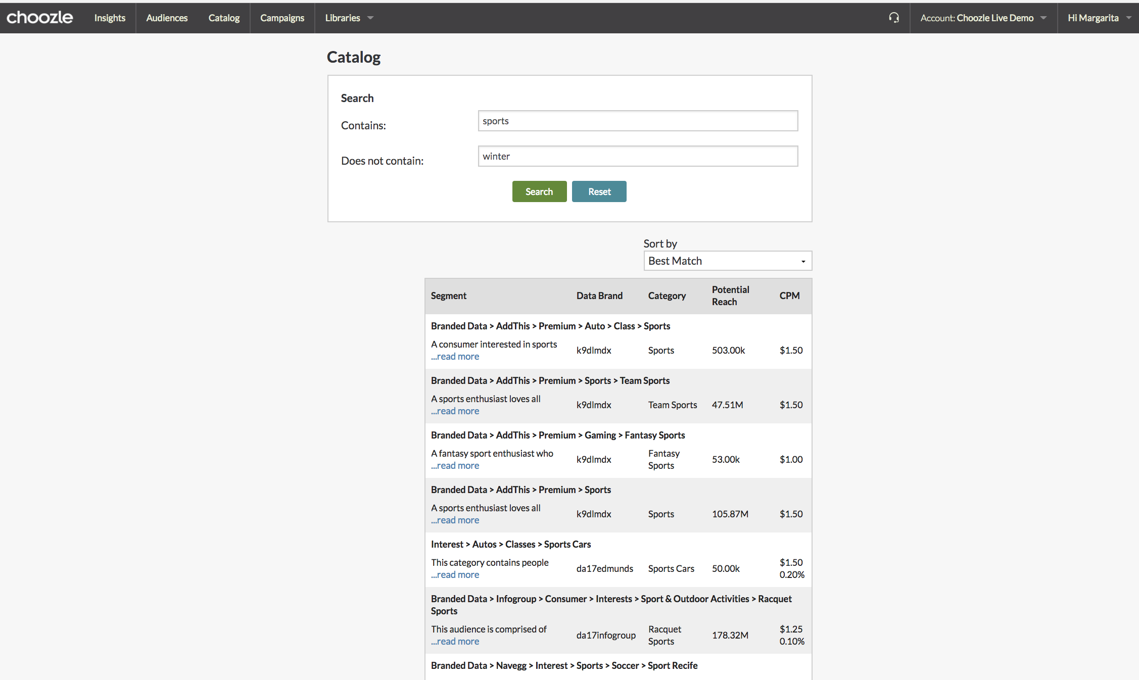
Below are the screenshot of what was tested.

key findings
The positive feedback I got was related to the new features I implemented in the new design and it showed me that I was on the right track. There was other feedback that on some functionality and design decisions made by the dev team so we needed to validate them and to revise.
Clean, simple, easy
Examples of keywords in search
Ability to type multiple words in search
Sorting by reach
Categories in data strings
It's fast
$ and % CPM in search results
Workshop 2
As part of Audience Builder Improvement, I organized and facilitated a workshop. I conducted research and had mockups ready for the Design Week so that we had with the stakeholders in the beginning if this project. Some things were prioritized below other features that were not related to the Catalog as it was a common effort of different teams.
I decided to workshop the things that were pushed back, and to have a more in depth research dedicated to the Audience Builder specifically.
Stakeholder Mapping
At first, I needed to define which of the stakeholders will be the best candidates for the workshop. I did a stakeholder mapping exercise.
The ones that have the highest contact with the Data Catalog and the will have the highest impact upon any changes in functionality or UI - the best candidates for the workshop.
Activities
1. Customer Journey
Together with the stakeholders, we built a user journey for Audience Creation and Audience Optimization to reveal the main steps and pain points of this processes. Personas were distributed to everybody so everything we talked about was tied to specific client’s perspective.



2. Ideation
Participants were given sticky notes (heart shaped ones because it was Valentines Day:) ) and asked to ideate as many solutions as they want for existing pain points (keeping personas in mind). Then they placed the sticky notes accordingly to each step of audience creation/optimization journey.


3. Affinity diagram
Participants were asked to group their sticky notes.

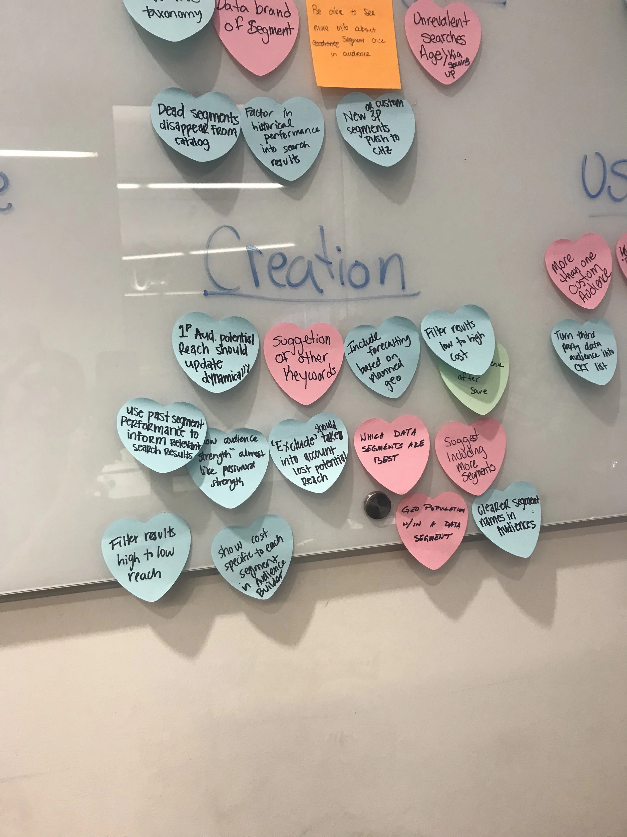


4. Prioritization (MoSCoW method. By the way that's where I'm from - Moscow, Russia:)
Participants were asked to prioritize their suggestions using a MoSCoW method where M - is "must", S - is "should", C- is "could", W - is "won't"


As a result of this workshop, I had a list of features that were prioritized by stakeholders. This list further was presented at the following Design Week.
Within one 6 week cycle I developed a design that provides an intuitive and seamless user experience. This project continued through the next cycle where I worked on redesigning the entire UI for 1st and 3rd party data. The idea was to combine all data groups on one page which would allow users to see all their audiences in one place (vs. current UI where users had to switch between pages to build an audience).
Alpha Release
Below is the UI design that was alpha released to our internal users (stakeholders) to gather their feedback and to iterate if needed before a client facing release.
Solution:
1. A more functional search that allows to exclude keywords, which gives users the ability to narrow down their search
2. A "Sort By" function that allows to sort search results by 4 different parameters, which gives the ability to browse search results in a more efficient manner
3. A "Filter By" function was redesigned and restructured, which allows users to use more appropriate categories as a filter. This makes users data shopping experience more intuitive and seamless. An additional filter for CPM type was added
4. Search results table now displays more information about data segments with an addition of the "Data Brand" and "Category" columns
5. All segments descriptions are expanded, which reduced that extra click users had to do before
6. An "Add" button was designed to add segments to the Audience Builder, which has made an audience creation process more intuitive
7. Search results pagination instead of and endless list of segments that required a lot of scrolling
8. A pop up that appears upon clicking "Add" contains two options of including CPM - $ and % which allows users to control their audiences cost


After Alpha release of the new 3rd Party Data Catalog I conducted a post-release feedback gathering with external users which helped to validate the new design and functionality as well as it brought up things that needed iteration. Those iterations were worked on in the following 6-weeks cycle.
Success Measurement: A few weeks after the full release of the redesigned 3rd Party Data Catalog I estimated that the support tickets related ti this page reduced by 75%, as well as time spent on the page decreased from 2 hours to 1.30 min. And I got happy customers who I built great relationships with and gained their trust and loyalty to the product.


