"CORKS" WINE STORE CONCEPT PROJECT
PROJECT BRIEF
I was tasked to incorporate an offline experience for the wine store “Corks” for the e-commerce site. “Corks” needed a better website that would advertise their specials and deals. It would also give a variety of options to search for wines as well as educate one selves
ROLE
Research, data analysis, information architecture and visual design
TIME PERIOD
2 weeks
PROJECT LIFECYCLE
USER RESEARCH
COMPETITIVE ANALYSIS
I conducted an analysis of three direct competitors and I reported following findings:
- Competitors provide information about their deals and incentives on the homepage
- The purchasing function wasn't developed on some websites, some sites had inefficient checkout process
- There was lack of wine learning features and direct instant communication with experts
INTERVIEWS AND CONTEXTUAL INQUIRY
I started my user research with interviews, that involved talking to stakeholders and customers to understand how much people aware of current prices and offers.
- The interviews revealed that some people were familiar with pricing for highly rated wine, but nobody knew about current offers.
- The store hasn’t changed anything in its advertisement for over 10 years and the existing website wasn’t being developed properly because of stakeholders lack of technical skills and advertising knowledge.
- The main factor of coming to Corks was the convenience of its location, but not their specials and prices.
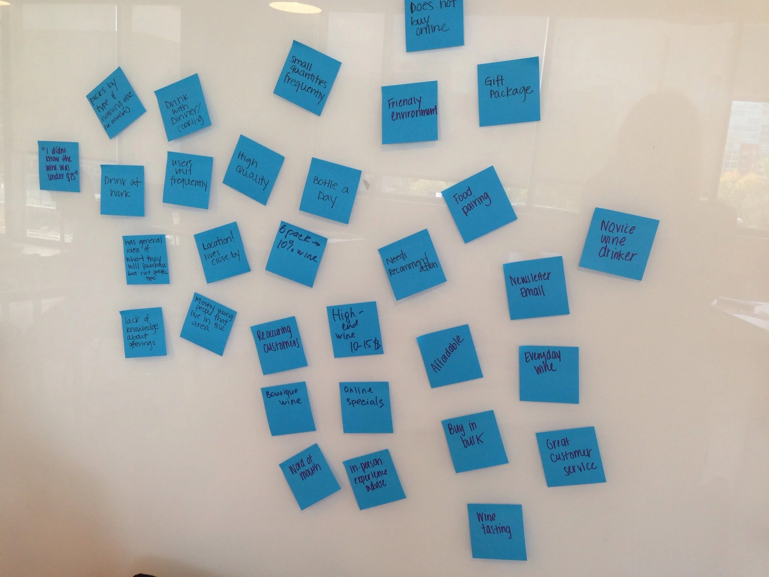
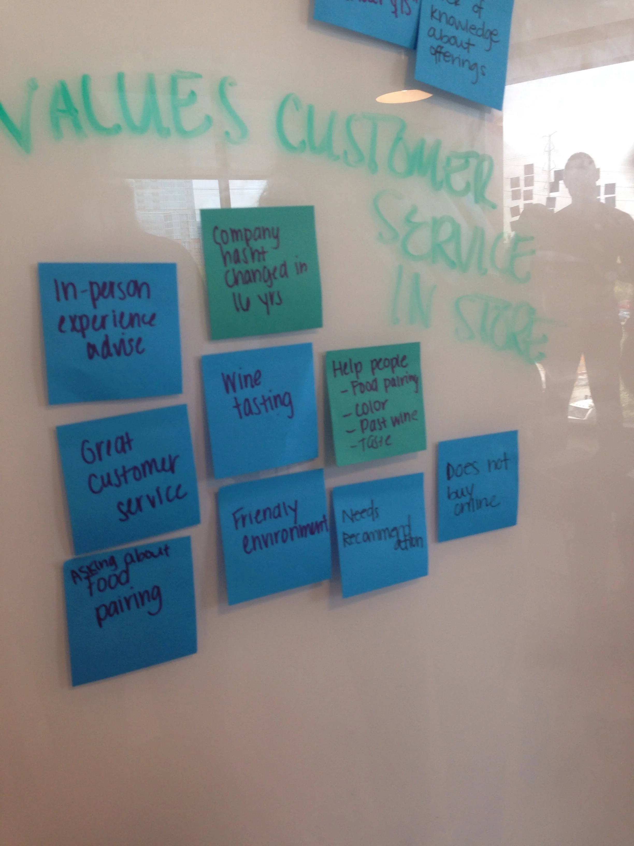
I used card sorting method to reveal patterns for gathered information.
PERSONAS
Based on the user research I created several personas and worked with two of them.
This helped me to stay focused on particular user needs and to be consistent in my design process.
- Primary - Frequent drinker
- Secondary - Occasional drinker
DESIGN STRATEGY AND SKETCHING
Using created personas and interview results, I sketched several versions of the homepage, presenting the information and features, that build a concise interface.
Goals:
- To present intuitive UI
- To display information clearly for users
- To provide necessary features for exploring, learning and easy purchasing
I tested a paper prototype first to determine the final site design. After I validated the right design, the low fidelity clickable prototype was tested.
USER TESTING OF CLICKABLE PROTOTYPE REVEALED A FEW KEY FINDINGS
- People were getting confused with unknown icons in the top navigation bar.
I named the icons so users can see what those icons do
- Many people like to learn by themselves and after that use the chat feature.
I added the quiz feature for defining appropriate wine types for a certain person, and the option to read and learn useful information about wine trends, news, and other helpful topics.
- Not everybody is familiar with wine store services.
I renamed the service button to show that by clicking it the catering and delivery information will appear
- People look for delivery information on the homepage, as it is important to know right away.
I added delivery information on the homepage.
These factors were considered for the following UI and the final prototype
SOLUTION
DYNAMIC NAVIGATION
The simplistic and flexible navigation allows users to search, explore, and filter wines based on the context of the shopping experience.
CUSTOMIZED IMPROVEMENTS
Users can explore more wine characteristics, including food pairing as well as read reviews and ratings and pick a sommelier to chat with.
SEAMLESS CHECKOUT PROCESS
Ability to express checkout, as well as ease of registered users checkout.
INFORMATIVE HOMEPAGE
Users can see all deals and offers as well as delivery information on the homepage
FINAL PROTOTYPe
ADDITIONAL DELIVERABLES
The user flow and site map outlines how this website interacts with the customer. The user flow shows the wine purchasing process and the site map shows the website structure.
USER FLOW
SITE MAP


