PACECAR
Project Details:
September - October 2020
My role - UX/UI Designer
Project goal - re-design of the current website for the upcoming launch.
I started with evaluation of the site and gathering the main findings. There were various things that could be improved in terms of user experience.
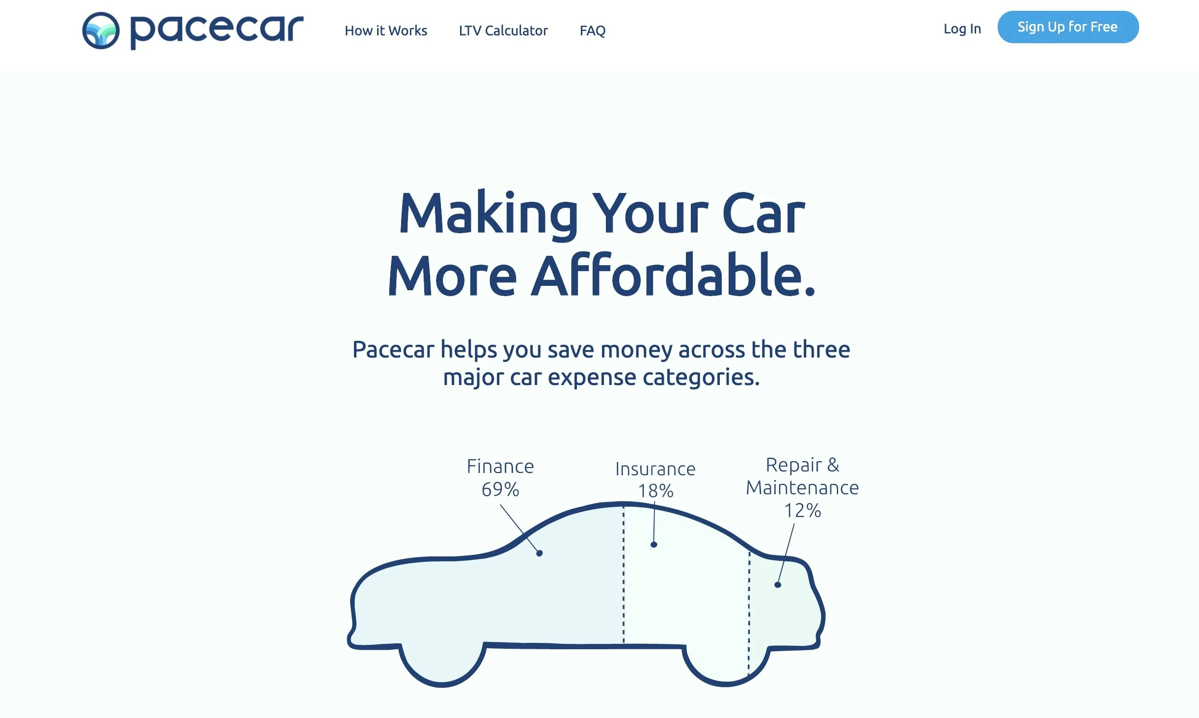
Starting with the homepage, I noticed a couple of things: there were multiple sections that had different calls to actions but all led to the same screen that had inconsistent title not matching the CTA buttons.
The homepage looked a little bland and I suggested adding more visuals.
It wasn’t necessary to show the features that were not implemented yet with the “coming soon” label.
The reviews provided seemed fake and not trust-worthy given the company was just starting out and didn’t have clients at that time.
What I did:
HOMEPAGE
Added a graphic image depicting a family which should build trust and cause positive feeling upon seeing it.
I re-arranged the top nav items including the executives request for adding a re-fi section.
I changed the UI accordingly to the color palette I was provided with.
The amount of sections was reduced to simplify access to the next step.
Removed fake reviews.
Added a footer.
At earlier design stage I had the LTV Calculator section moved as a separate page accessible from the top nav but later it got removed per client’s request.
USER FLOW
The client expressed concerns with the user flow. Different sections and call-to-action buttons led so similar screens with slightly different information requested and depending on where a user would come from the screen they would see the same screen and adding that extra piece of information was confusing.
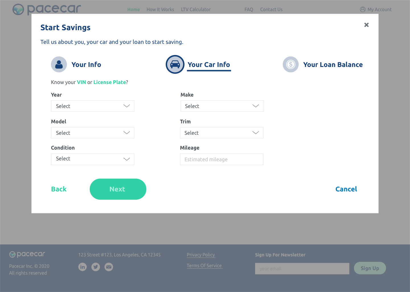
I worked on a user flow and I implemented a more user-friendly path for each specific scenario instead of having them all mixed in one.
Start Savings: Homepage - Start Savings - Personal, Vehicle, & Loan Information - Find Offers
Re-finance: Homepage - Re-Fi - User Information - Find Offers
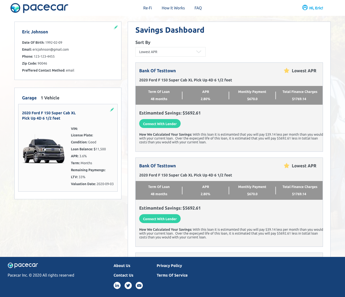
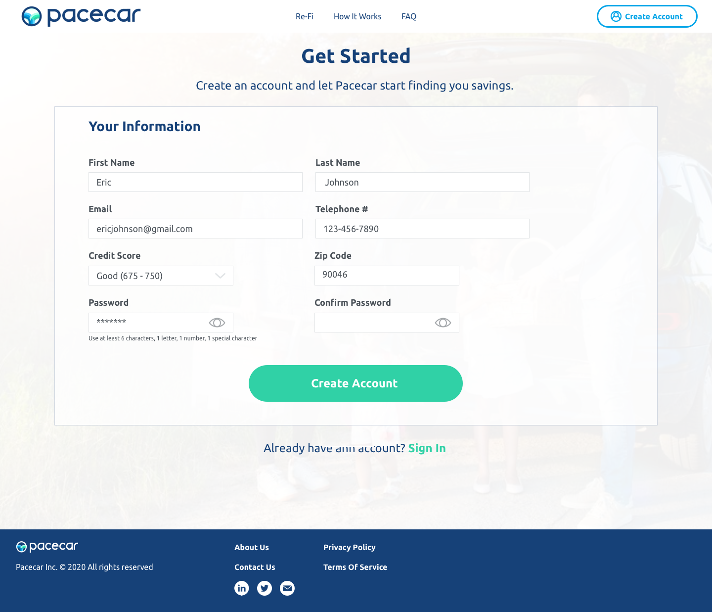
Create Account: Homepage - Create Account - Registration Information - Optional Personal, Vehicle, & Loan Information - My Account
Start Savings
After completing steps in this flow a user will end up selecting a method of contact and once a suitable offer is found, a representative will be reaching out.
Re-finance
This flow is similar to the Start Savings one, except that a user has enter more information on their credit. This flow also leads to a screen with available offers.
Create Account
Initially there was no place to create account, just a log in window which wasn’t right. I built the account creation flow where a user enters their information and has optional steps that are allowed to be skipped. If a user entered some of the personal and vehicle information during the Start Savings or Re-Fi flow, then it will be automatically pulled to the account creation form.
How I changed it:
Information Architecture
I re-structured the sitemap by providing a more intuitive navigation to sections that I either combined or separated, based on their relativeness to each other and the content within them.
UI re-design
According to a new color scheme and the UX/UI methods I use for seamless and intuitive interfaces, I changed the look and feel of each page.
Te About Us page was requested to be removed by the client later on.


